Sample theme sheet · Tidewell Studio
One app, three ways it could look.
Before your app is built, you get a sheet like this. Each option shows the colors with their codes, the fonts, a few real pieces of the interface, and the actual screens wearing that look.
Pick one, mix two, or send us the brand colors you already use. Whatever you choose becomes the theme of your clickable prototype, and every screen changes with it.
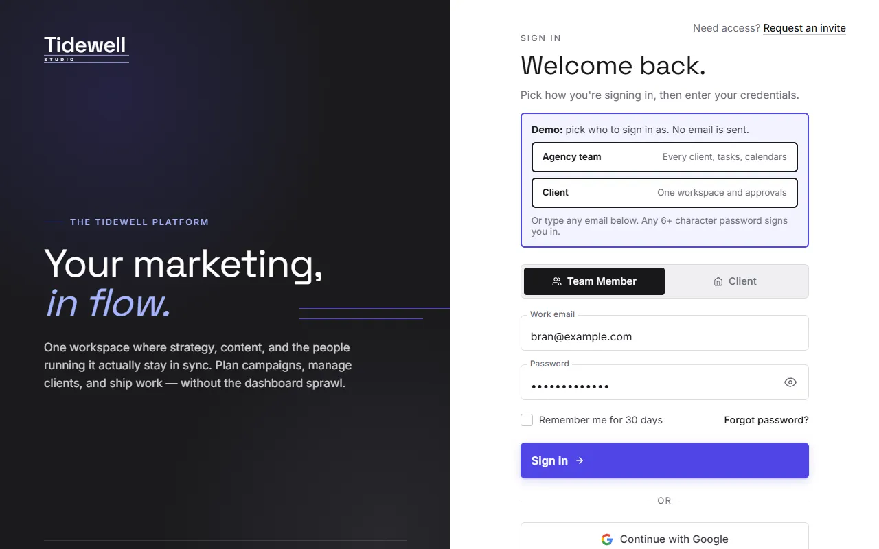
Graphite & Indigo
Modern product software. Near-black, a bright indigo accent, a geometric sans and tighter corners.
Colors
Type
Your marketing, in flow.
One workspace where strategy, content and the people running it stay in sync.
Headings: Space Grotesk · Text: Inter
Interface
✓ White on the accent: 6.3:1. Passes WCAG AA for readability.
Try this look live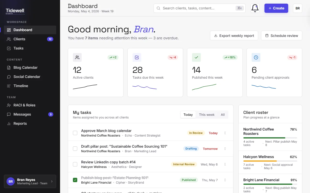
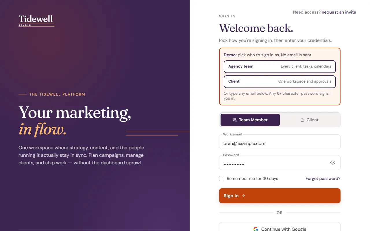
Plum & Ember
Warm and boutique. Deep plum with a burnt-orange accent, an editorial serif and softer corners.
Colors
Type
Your marketing, in flow.
One workspace where strategy, content and the people running it stay in sync.
Headings: Fraunces · Text: DM Sans
Interface
✓ White on the accent: 5.2:1. Passes WCAG AA for readability.
Try this look live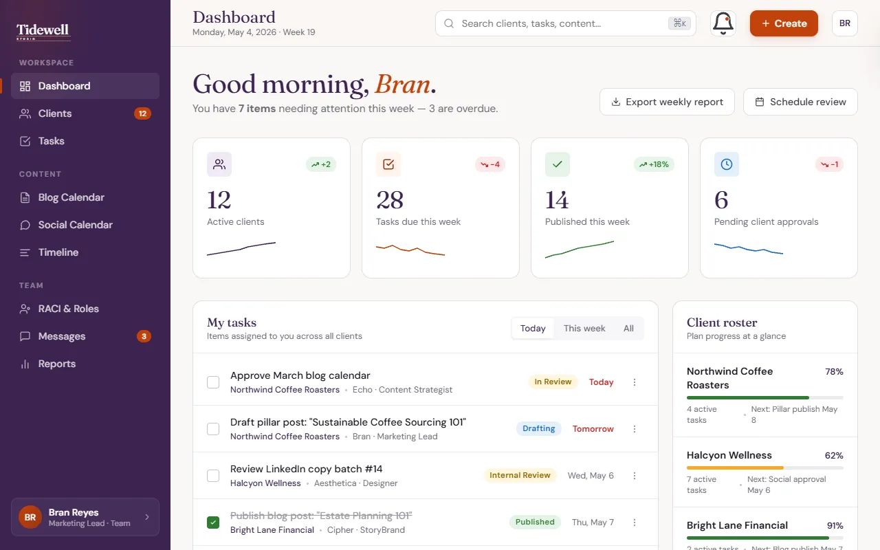
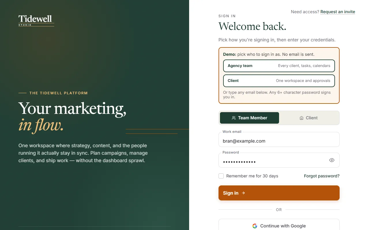
Forest & Brass
Established and calm. Deep green with a brass accent and a classic serif for headings.
Colors
Type
Your marketing, in flow.
One workspace where strategy, content and the people running it stay in sync.
Headings: Newsreader · Text: Inter
Interface
✓ White on the accent: 5.0:1. Passes WCAG AA for readability.
Try this look live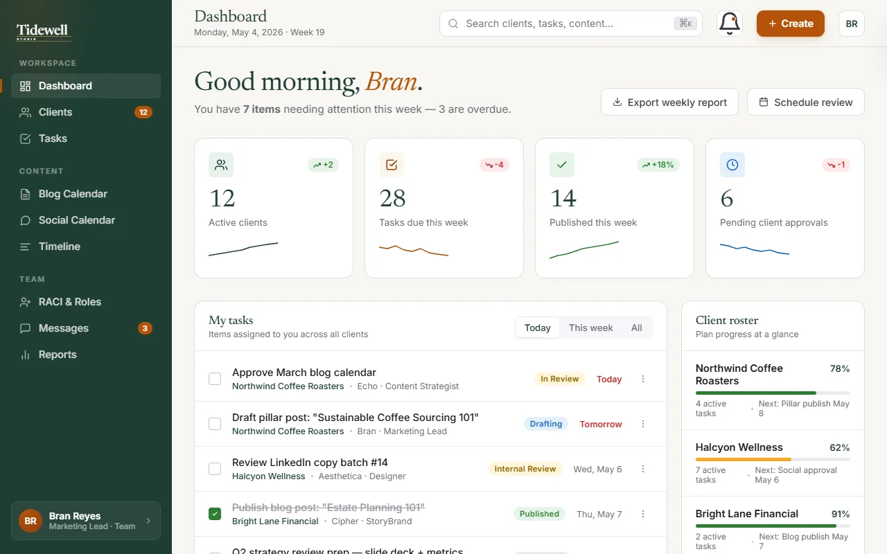
How it works on your project
Built around your brand: your logo, the colors you already use, and a couple of directions you might not have considered.
Choose one, combine two, or ask for a tweak. Changing a color here takes minutes, not a sprint.
Every screen of your clickable prototype switches to your look, so you approve the real thing, not a swatch.
Tell me what you're building and I'll show you a few looks for it.